
Understanding and applying color theory can significantly enhance the impact of your images. In this Blog post we will explore the basics of color psychology and its influence on human emotions, learn more about color harmonies in form of the color wheel, and discover practical ways to integrate color theory into your photography, from styling to selecting locations and backdrops.
The Basics:
The basics involve primary colors (red, blue, yellow), secondary colors (green, orange, purple), and tertiary colors, formed by mixing primary and secondary colors. Complementary colors (opposites on the color wheel) create contrast, while analogous colors (next to each other) provide harmony.
Beyond the wheel, aspects like hue, saturation, and brightness come into play. Adjusting these elements allows you to control the mood and visual appeal of your photographs.
Color Psychology Basics:
Before getting into the technical aspects, it's crucial to look the fundamentals of color psychology. Colors evoke emotions and convey messages, and being aware of these associations can add depth to your visual storytelling. For instance, blues and greens often evoke tranquility and nature, while reds and yellows exude warmth and energy. Keep this in mind as you compose your shots to create a more intentional emotional impact.
Here are some examples:
- Red: Energy, passion, love, warmth, vitality of life.
- Blue: Calmness, trust, and reliability.
- Yellow: Optimism, happiness, and creativity.
- Green: Growth, nature, and harmony. It can also symbolize fertility and freshness.
- Purple: Royalty, luxury, and mystery.
- Orange: Energy, enthusiasm, and warmth.
- Black: Elegance, formality, power and mystery.
- White: Purity, innocence, simplicity, and cleanliness.
- Brown: Earthiness, stability, and reliability. It can also evoke a warm, comfortable feeling.
- Gray: Neutrality, balance, and professionalism.
Color Harmonies and Relationships:
Let’s get more technical and look at color wheels. A color wheel is a circular diagram that showcases the relationships between colors. Typically, it starts with primary colors, red, blue, and yellow, evenly spaced around the wheel. When you mix these primaries, you get secondary colors (green, orange, purple), filling the spaces in between. The wheel continues to tertiary colors, formed by combining a primary and a neighboring secondary color.
The color wheel is your tool to harmonious compositions. Here are various schemes:
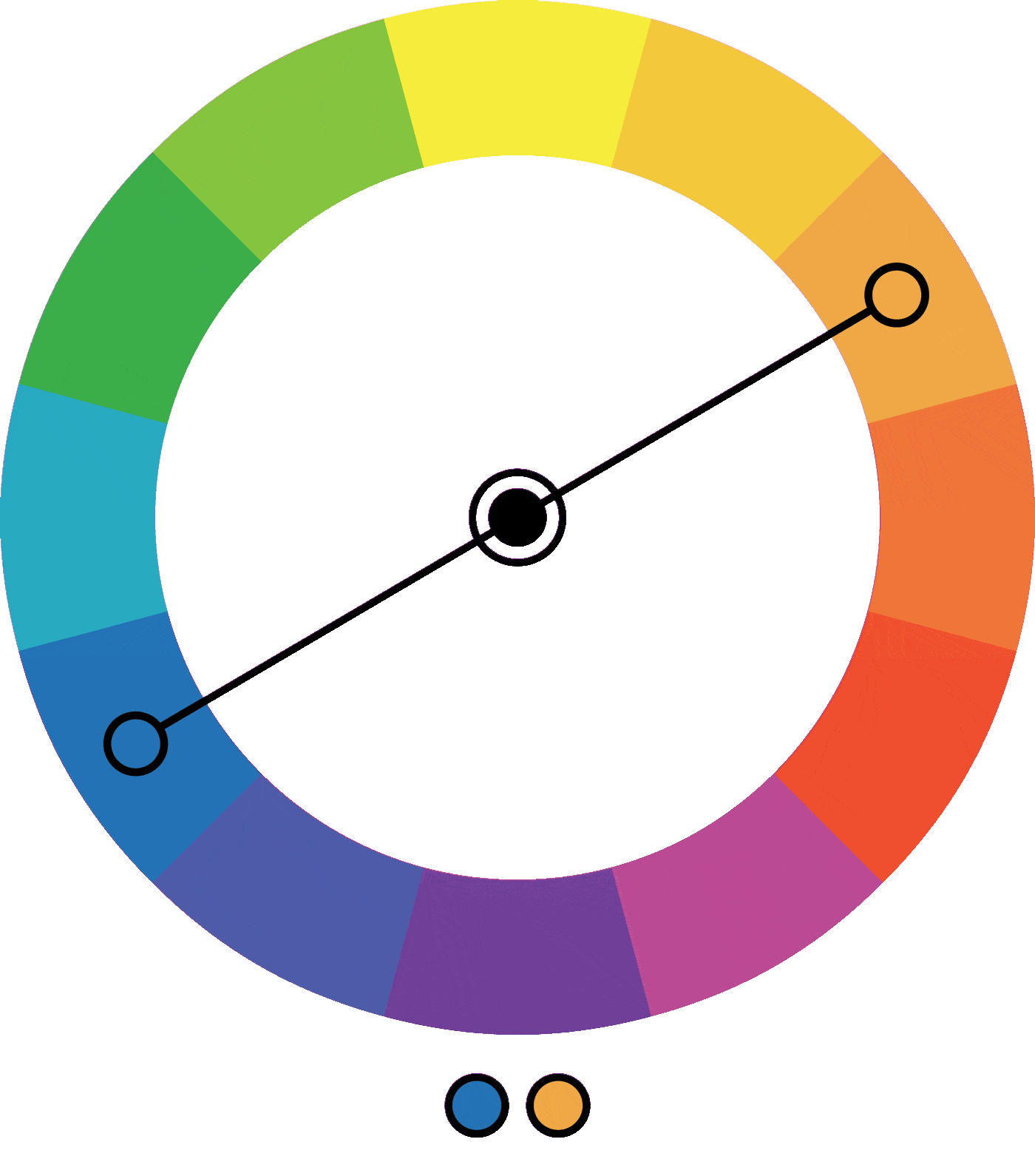
Complementary Colors:
Complementary colors are pairs of colors that, when combined, create a strong contrast and reinforce each other, making both colors appear more vibrant. Here are some classic complementary color pairs:
- Red and Green: This pair is bold and high-contrast, often associated with the holiday season. It can convey both energy and balance.
- Blue and Orange: This combination is dynamic and frequently used in sports teams' color schemes. It provides a strong visual impact and a sense of excitement.
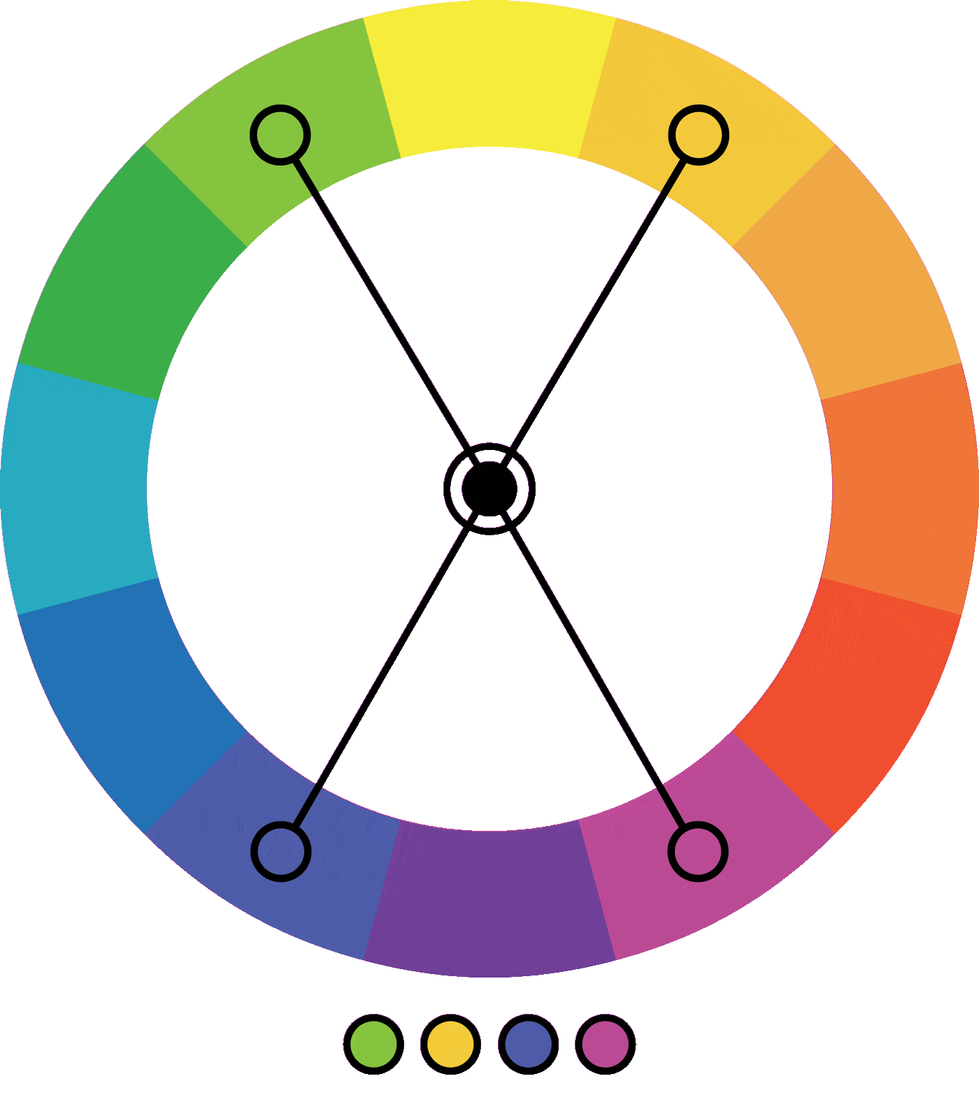
- Purple and Yellow: This pairing brings together the richness of purple with the brightness of yellow, creating a harmonious yet attention-grabbing effect.

Split-complementary Colors:
Split-complementary colors are a variation of the complementary color scheme. In this scheme, instead of using one color and its direct opposite (complementary color), you use one base color and the two colors adjacent to its complement. Here are the key features of split-complementary color combinations:
Analogous Colors:
Analogous colors are next to each other on the color wheel and share similar tones. This creates a harmonious and unified palette. Here are some examples of analogous color schemes:
- Red, Orange, and Yellow: This warm combination creates a lively and energetic feel, often associated with sunsets.
- Blue, Blue-Green, and Green: These cool tones evoke a sense of calmness and tranquility, reminiscent of water and nature.
- Yellow, Yellow-Green, and Green: This fresh and vibrant combination is often found in natural settings, like lush landscapes.
- Orange, Red-Orange, and Red: A fiery and passionate palette, these colors work well together to convey warmth and intensity.
- Purple, Red-Purple, and Red: This combination is rich and regal, often associated with luxury and sophistication.

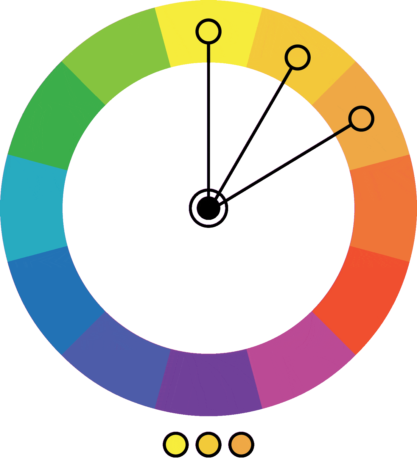
Monochromatic Colors:
Monochromatic colors revolve around a single hue but vary in their shades, tones, and tints. This color scheme creates a visually cohesive and harmonious look, making it a popular choice for a minimalist and elegant aesthetic. Here's a breakdown:
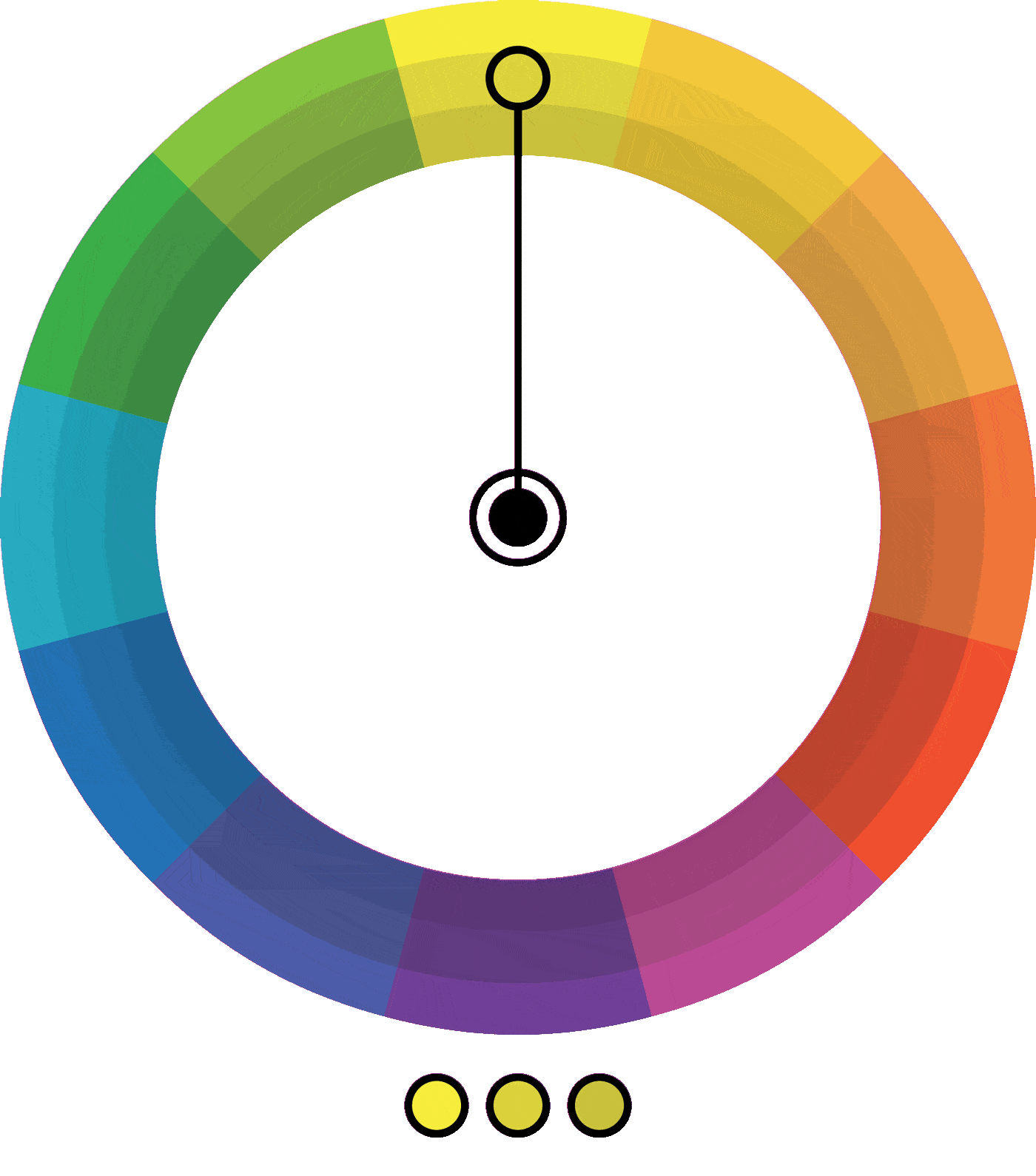
- Single Hue: Monochromatic color schemes are built around one base color.
- Variation in Intensity: The color is used in different shades, tones, and tints. Shades are created by adding black, tones by adding gray, and tints by adding white.
- Simplicity: Monochromatic palettes offer a clean and simple aesthetic, allowing for a focused and unified visual impact.
- Subtle Contrast: While there's minimal contrast compared to complementary colors, the subtle variations in intensity provide a gentle visual interest.
- Elegance and Sophistication: Monochromatic schemes are often associated with sophistication and a modern, timeless elegance.
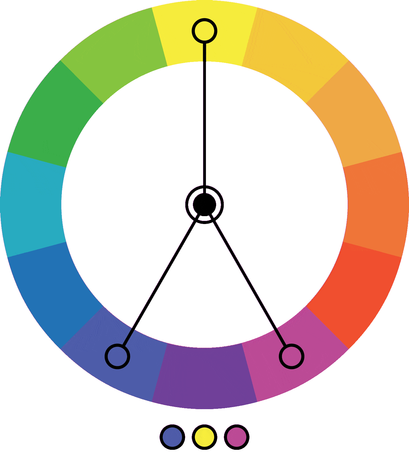
Triadic Colors:
Triadic colors involve selecting three colors that are evenly spaced around the color wheel, forming an equilateral triangle. This color scheme provides a rich and balanced visual appeal. Here are the key aspects of triadic color combinations:
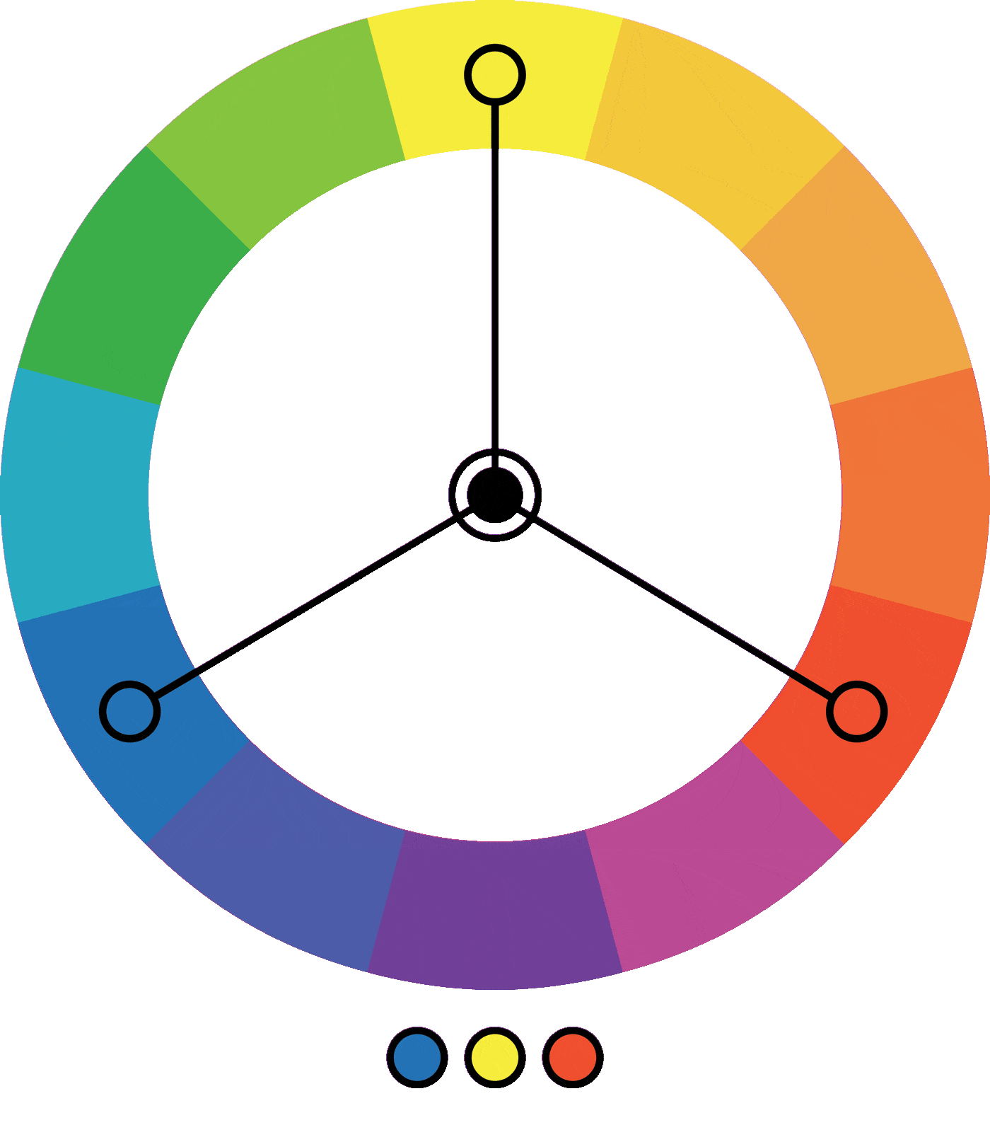
- Equal Separation: The three chosen colors in a triadic scheme are evenly spaced, creating a harmonious balance.
- High Contrast: While not as intense as complementary colors, triadic schemes still offer a good level of contrast, making the colors stand out.
- Versatility: Triadic color combinations can be warm or cool, depending on the specific colors chosen. This versatility allows for a wide range of visual effects.
- Dynamic and Vibrant: Triadic colors bring vibrancy and dynamism to a composition, making them suitable for lively and energetic scenes.
- Color Harmony: The evenly spaced distribution on the color wheel ensures a balanced and visually pleasing harmony.
Tetradic Colors:
Tetradic colors, also known as double-complementary colors, involve selecting four colors together in the form of two complementary color pairs. This color scheme provides a high level of color variety while maintaining balance. Here are the key characteristics of tetradic color combinations:
- Complex Harmony: Tetradic colors offer a more intricate harmony compared to other color schemes due to the inclusion of two complementary pairs.
- Color Richness: The four colors allow for a diverse and rich palette, providing ample opportunities for visual interest.
- Versatility: Tetradic color schemes can be adjusted for warm or cool tones, providing flexibility for different atmospheres and moods.
- Balanced Contrast: While there is a high level of contrast, the use of complementary pairs helps maintain balance within the composition.
- Visual Complexity: Tetradic colors can add depth and complexity to your photography, making them suitable for scenes with multiple elements.
Practical Application in Photography:
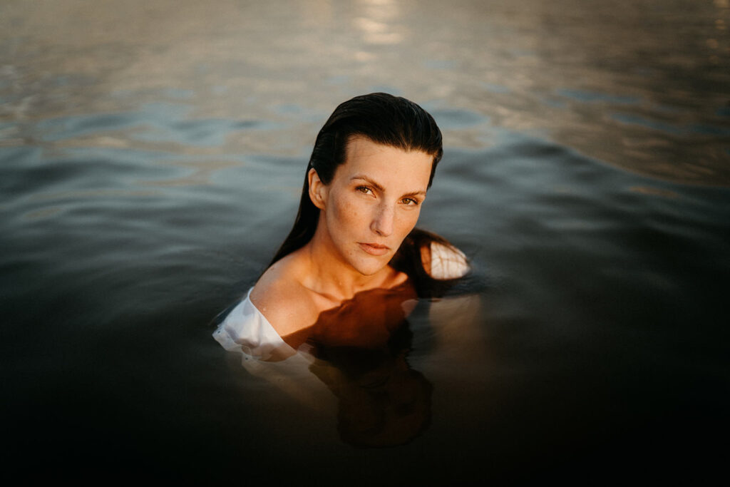
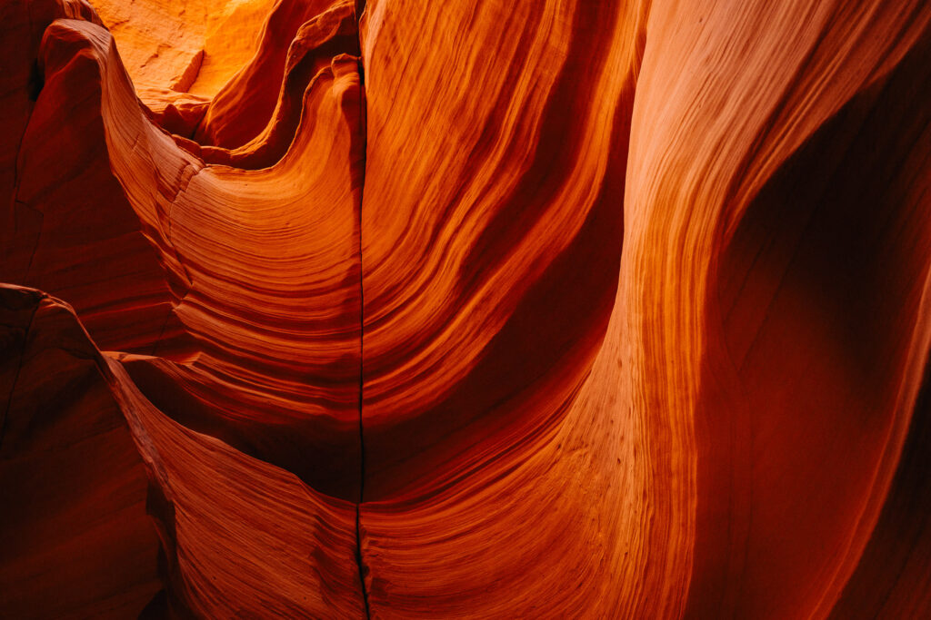
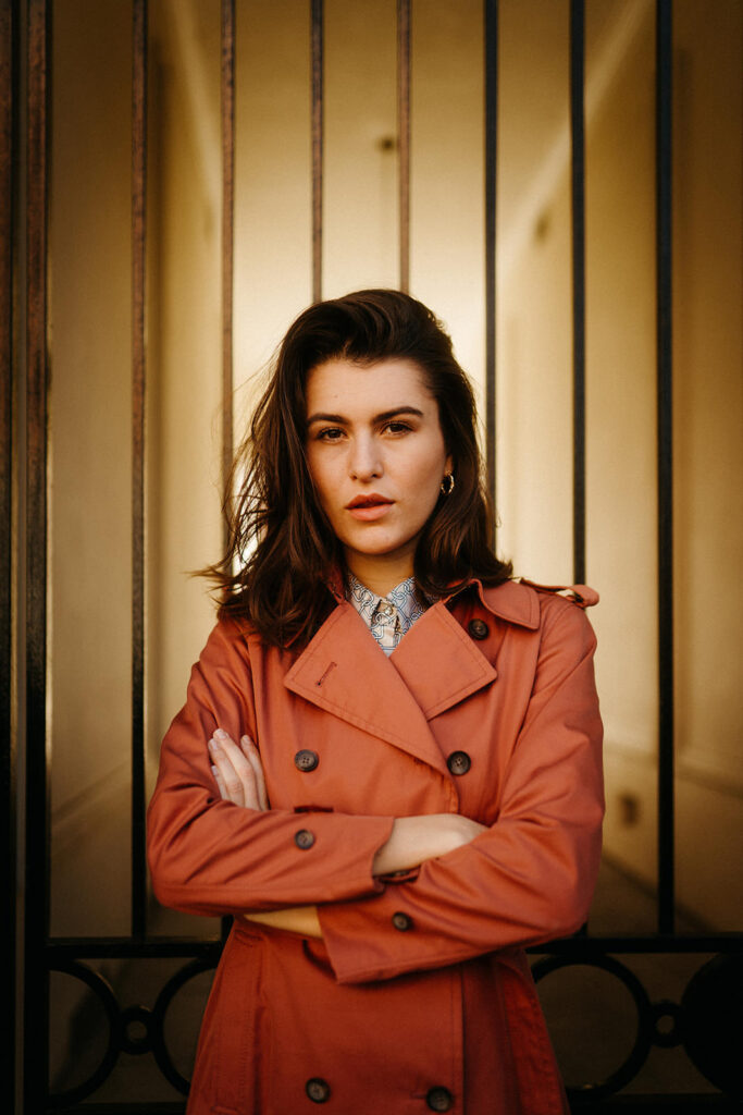
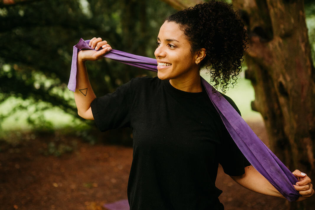
Now, let's translate theory into action. When styling your subjects, consider the emotions you want to evoke and choose wardrobe colors accordingly. Pay attention to the backdrop and location – a natural setting with earthy tones can enhance a sense of warmth, while an urban environment with vibrant colors may inject energy into your composition.
During the shoot, leverage color theory to guide your compositions. Experiment with contrasting elements to draw attention to specific focal points. This could involve placing your subject against a complementary backdrop or utilizing analogous colors for a more serene atmosphere. I personally like to use monochrome outfits and locations to spotlight emotions, especially for couple shoots, but I also like to play with complementary colors if it suits the situation and concept.
Summary:
Incorporating color theory into your photography elevates your work from "boring" images to emotionally resonant ones. By understanding the psychological impact of colors, exploring harmonies through the color wheel, and applying these principles in your shoots through the right choice of outfits and locations, you're sure to create better photographs. And the most important part is: don't feel pressured, just have fun with colors and use this knowledge to experiment. Have fun!
Also, feel free to check out my guide on selecting the perfect outfits for your shoot. You'll quickly see how color plays a crucial role in achieving harmonious photos. You can find this post here: What to Wear for a Couple Shoot – The Complete Guide
Share this story
